

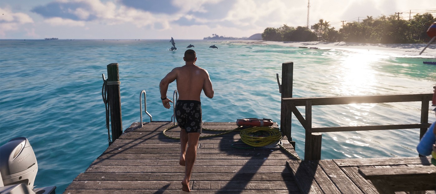
Almost a half-hour gameplay demonstration of GTA 6, first shown on Netflix and then shared on YouTube, finally let people see the game moving in real time. The crowd reaction was broadly positive — but one small thing set off a surprisingly loud debate: the on-screen interface, i.e., the HUD, weapon wheel, and item menu.
Fans tore the footage apart, frame by frame. Much of the heat landed on the weapon/inventory selection wheel. The developers used colored icons to separate guns from melee, healing items, and garments; the individual slots are rectangular while the selector is circular, and that visual mismatch rubbed a lot of viewers the wrong way.
Ben Videotech, GTA content creator: I don't like the HUD so far. The minimap looks good, but the weapon wheel doesn't really please me. I think they should go back to the drawing board and redo it.
The GTA Assassin: An unpopular opinion – GTA 6 needs to fix this simplified interface. It lacks character, it looks unfinished. Everything else in the game looks top-notch.
Gameroll: Yes, the interface is definitely the weakest point for me. I won't criticize the GPS much, as I assume it can be adjusted somehow, but the rest of the HUD is at best just passable. It's simple and clear, functionally everything will be fine, but it’s really boring and, in my opinion, lacks individuality.
A Reddit thread titled "The interface needs improvement" on Reddit picked up steam; upvoted comments called the look overly spare and, frankly, bland. People zeroed in on the health and focus indicators — some argued those bars lost all personality. Others admitted they'd adapt, yet the angular slots inside a round wheel kept nagging at many.
Over in PC Master Race, a post reminding readers that, after the 2022 leak, folks defended the simple UI by saying "it's just a placeholder" earned 3k+ upvotes. That caught scorn: how could a game with a record budget and years of dev work ship with such a restrained layout? Fans shared a mockup where the cells had rounded corners; it didn’t cure every gripe, but people liked how that tiny change softened the overall feel — the least they expected, some said.
There are defenders of minimalism too. A slice of the audience thinks Rockstar purposefully removes visual clutter so the action stays front-and-center; others point out the studio usually keeps menus concise (Red Dead Redemption 2’s stylized HUD may be the oddball). Plenty hope for a last-minute overhaul, but history suggests Rockstar’s trailer UI often survives to launch—look at the original GTA V trailer and how close the shipped weapon wheel stayed to that version, save for a color filter tweak. Sure, icons and shapes could still change, but the safe bet is this HUD will be what players boot up in November. And, honestly, many are willing to live with it if it means no more delays.